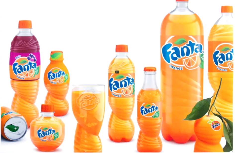
How consumer insights lead to new Fanta pack design
Everyone knows someone who likes to bend the rules a bit. Someone who is told to do something one way, but immediately asks "Why?". Someone who hears "no", yet does it anyway.
Gregory Bentley and Leyton Hardwick are two such people, whose curiosity and drive to do something different led to the newly designed Fanta bottle.
First appearing on shelves in 1940s, Fanta is The Coca-Cola Company’s biggest brand after Coke. Like any great product, Fanta has evolved over the years, with a few bottle re-designs under its belt. But until now, the bottles have always had one thing in common – they’ve been symmetrical.
“The process of designing a bottle like this is very, very restrictive. We have multi-million-pound bottling production lines to think about. You’re working within a pre-agreed tube shape – if you pull capacity from one point, you need to add it in to another. You can’t take it out, without adding it in elsewhere,” says Bentley, packaging innovator at Coca-Cola Great Britain. “And of course, with a carbonated drink, the bottle has to be symmetrical, or it’ll bend.”
There is more pressure in a carbonated beverage bottle than a car tire. As soon as there is a deformation, or a difference in strength of the PET plastic, sections become weak and they can pop out or deform.
The new spiral Fanta bottle isn’t symmetrical at all. Inspired by the twisting of an orange to release the juice and flavor, it has a series of "ribs’, with a torsion in the bottom half.
The concept of incorporating the "twist" or "squeeze" came about in the very first kick-off session hosted by design agency Drink Works.
“How people interact with a product is where we start a project,” says Hardwick, creative director, Drink Works, “We got young people in a room, gave them fruit, carving kits, plasticine, play-do, pens, paper, told them to just play – make a mess! Observing people do what comes naturally when they’re thinking of a drink and oranges like this was incredibly insightful.”
